
 I got a freak chart for you that’s stunning, but bear with me here because it requires some background and patience. Most of us are focused on the daily or weekly action and it’s easy to lose sight of big cyclical trends. We don’t think of them as they take a long time to unfold and the daily noise is so much more dominant.
With the advent of permanent central bank intervention sparked by the financial crisis all of us have come accustomed to markets always going up with the occasional correction in between and the timing of corrections have seemingly become shorter and shorter. Big fat bottoms that happen after just a few days of temporary terror. We haven’t seen a true bear market since the financial crisis and even that one lasted barely more than a year as central banks stepped in. The last longer term bear market came after the technology bust in 2000 when markets bottomed in 2002 and 2003 and then proceeded onto the next bull market.
It didn’t always used to be this way. Going back to 1900 there were multiple extended periods of stock markets going nowhere and trading in wide chop ranges:

One could even argue that the period between 2000 and 2012 was such a period before markets finally broke above their 2007 highs.
But looking at this very long term chart we can note consolidation periods that were much longer, most notable the period between the 1960’s and the early 1980’s. No progress whatsoever, but then something happened and the answer should be obvious: The advent of personal computing, the internet and information technology. It changed everything and accelerated the world to never before seen wonders. But it also has come at a cost and we may be seeing the effects of this cost unfold in front of our eyes.
View it from a big macro perspective: Central banks have done their best to lead a global economy back to organic growth coming out of the financial crisis. The promise was full employment and inflation back to 2%. If you look at the official statistics they’ve met their unemployment goal, but they kept missing on the inflation front. Why? Because they are fighting the greatest deflationary force known to man: Technology. Companies like Facebook and Netflix have stamped out massive audience businesses requiring few people to serve them. The scalability of technology is incredible. Hence the economic model has changed and it’s all a bit inefficient for the many, but highly effective for the few. It is no accident that wealth inequality has expanded to the extreme degrees we witness today. It’s no accident that the tech titans are the richest people running around the planet. And given central banks’ desperate actions to ward off these deflationary forces they’ve enabled not only the renewed acceleration of asset bubbles again benefitting the very few, but they’ve also encouraged the taking on of unprecedented government and corporate debt and BBB rated junk debt in the process.
And now it gets interesting. In 2018 we witnessed a global blow-off top following 10 years of central bank intervention and following the US tax cut. Peak artificial liquidity. Global central bank balance sheets peaked in January 2018.
Where did the $DJIA stop? Not at some arbitrary point. No sir, it stopped at a very particular point, a point only a freak chart can suggest.
As many of you know I’m a big fan of trend lines and here it is, the freak chart:
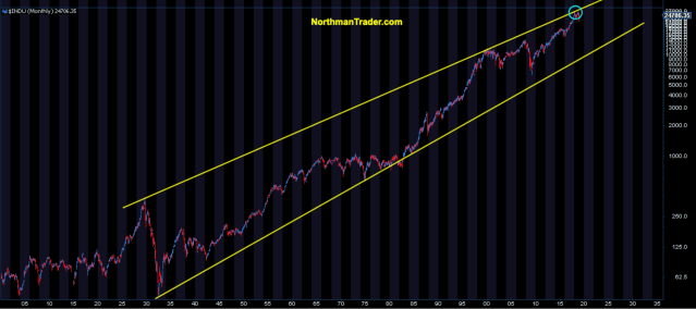
1929 top, 2000 top, 2018 top (if 2018 is a top), but there is little denying the obvious: The $DJIA stopped twice in 2018 at a trend line that dates back to the starting points of 2 major crashes. 1929, and the 2000 technology crash.
The consequences? Immediate doom and gloom? I can’t say, what I can say is that this trend line has been massively relevant and is very much confirmed. Some may dismiss it as a fluke of course, but that would be a hell of a fluke.
Note there is a lower trend line there. This lower trend line has been left in the dustbin of history, untouched since the advent of the technology boom. The world has changed greatly since the 1980s, but the ghosts of historic debt expansion and slowing growth are all around us. If we can’t see massive organic growth with the largest artificial liquidity injection in human history what will it take? I have to ask.
What if it took all this artificial liquidity to barely squeak out 2% growth? That spike in GDP growth in the US last year? Looks very much temporary as the effects of the tax cut barely lasted 9 months.
Here’s the latest global growth forecast by the IMF:

2020 starts in less than 12 months and look at those far right columns.
Nobody wants to predict a recession of course, but these numbers are skirting awfully close to a recession.
1.3% GDP growth for Germany in 2019? 0.5% GDP growth for Japan in 2020? All these places still have negative rates and/or full intervention. US sub 2% in 2020 while the country is running trillion dollar deficits?
That’s the grand result of 10 years of artificial liquidity injections?
What if that’s the best this new economic reality could achieve under the structural circumstances? What if the technology growth boom is petering out? What’s $AAPL’s next big path to growth? Another iPhone version? Hardly.
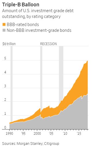
No, it may just be that slowing growth globally will force the world to come to terms with the largest debt expansion in history and perhaps all of a sudden all that BBB rated junk debt will become very relevant very quickly:
Who is to say? I suggest nobody knows because the world has never before been in these circumstances.
But if things do indeed turn sour than our freak chart has some potential technical destinations to consider:

I’ve added some fibs to this long term chart and adding to the intrigue is the fact that these fibs line up with major previous market pivot points. Perhaps that’s just another fluke, but is it so unreasonable to presume that a 10 year record liquidity injection and record debt expansion has perhaps caused asset prices to overshoot? Just reversing back to the 2015/2016 area would constitute a .382 fib retrace. A 50% retrace would bring $DJIA back to the 2007 highs. A .618 fib retrace would bring $DJIA back to the 2011 lows and perhaps tag the lower trend line, timing dependent.
In context of a 90 year chart is such a technical retrace to the lows of just 8 years ago unreasonable? I have to ask.
Especially if you realize that 61.8% of the gains in that 90 year $DJIA chart have come in just the last 8 years. 😳
Ponder that.
For the latest public analysis please visit NorthmanTrader. To subscribe to our market products please visit Services.
All content is provided as information only and should not be taken as investment or trading advice. Any investments, trades, and/or speculations made in light of the ideas, opinions, and/or forecasts, expressed or implied herein, are committed at your own risk, financial or otherwise. For further details please refer to the disclaimer.
Categories: Market Analysis


Great historical perspective, thanks. It’ll be interesting to see whether Fed and other CB’s recognize they’re at a dead end and give up the stimulation game willingly, or go down printing and cutting for all they’re worth.
the fed will take the House down with them. they will keep the pedal to the metal until the wall is hit. its their nature. von mises already told us what will happen.
Fascinating historical context. Sets you back on your heels. Many thanks.
The cult of equities constant mantra of “don’t sell, buy the dips” may be dead wrong for the next 5-10 years. Bonds outperform stocks in deflationary environments. What if China’s GDP growth is actually 3%, roughly equal to population growth, over the next couple years? The ’78 disco song “Freak Out” will be the theme song for the Freak Chart!
Thanks Mike.
Sven; interesting take on the advance, certainly don’t argue with your thinking but I want to point out those are not Trend Lines they are price channels – big difference and it’s not just semantics. calling those Trend lines is an analysis error, likely due to an inaccurate definition of Trend. Feel free to contact me if you want to unpack this…
Hi Mike, I don’t disagree, one may view them as price channels although I prefer channels to be parallel and this is not. My priority is to look for points of relevance irrespective the definition and that top line is relevant.
I think you are wrong in something. Your trend lines draw a wedge and that’s wrong, they should be parallel. If you take the fibonacci retracements from 1929 and increase the view you will see the retracements don’t allign perfectly with the peaks of 2000, 2008 and 2018. BUT, if you take the fibonacci retracement from 1987 crash everything matches, the match is perfect. Also, if you take fibonacci time zones from 1987 it’s incredible but peaks align with the lines incredibly well.
So then, if we take parallel trend lines instead of wedge lines and we place another parallel line in the middle of the trend channel… what do you see? That the down peak of 2008-2009 MATCH with the middle of the trend channel…. also the peak of 1987 and all the cycle from 1990-1995.
That will imply something horrible, that if we go straight to the long recession we are talking about, we will touch the down trend line at around 5000 points of the DJIA. If we do that as we did in 1929 we will do it in two phases, we will touch the middle of the trend line (11000 points), then bounce and then we will go to the 5000 points. In 1929 we did that process in 2 and a half years, if we repeat it, we will finish at the middle of 2021, touching the middle in 2020.
Nice analysis… I also want to mention that you can’t call lines that converge, as in a wedge, “trend lines” if so you have to answer ‘what are they when they cross? ” the median you suggest is the Trend .. the others are price channels, boundaries or trend extremes but not “Trend Lines.” I realize that this challenges traditional TA language but as the purpose of language is to provide clarity I’d like to see the change
Hi Daniel, appreciate the comment. I need to see if I can upgrade this comment section to permit uploading of charts so I can see what you are referring to.
Sven, a bearish wedge is certainly a relevant pattern, and this third touch of the line certainly confirms it as an established trend. And price may pull back from current levels (some or a lot), or they might not pull back at all as the established trend line does move higher from current levels and the down trend line is a long way from being broken.
I’ve been looking at a yearly chart of the DOW going back to 1915, so just over 100 years. I have on it a 5 period simple moving average (high,low,close/3). It is a decent indication of trend and as long as price closes above the line on a yearly basis the up trend can be considered still valid.
Currently, the 5 sma is at 21,323 and the index is at 24,737. So that is positive.
The DOW closed 2018 at 23,327 which was 17% above the 5 year average of 19,925.
Also, there is a 161.8 Fibonacci extension at 24,559 that prices have been bumping against for two years now. (The Fibonacci ext is drawn from the 1974 low to the 2000 high and back to the 2009 low.) And it also struggled for two years with the 100% extension move before finally breaking through it.
Now the market could certainly head lower from here, it could chop around in a flat range for a while, or it might head higher. I don’t know what it is going to do, but the market seems to surprise folks a lot and so many folks are speculating on a decline that I wouldn’t be surprised to see it do the unexpected. https://www.screencast.com/t/AdsIO3Gr